Style
The 2026–2027 Bathroom Color Playbook: Warm Neutrals Are In, Stark White Is Out
Nov
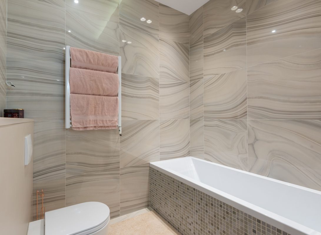
For a decade, the default bathroom was a white box: white tile, white vanity, white walls, chrome everything. It photographed well and offended no one. But walk through any 2026 design showcase and you will notice the shift immediately — bathrooms have gone warm. Greige walls, honey-toned wood vanities, creamy stone, and soft clay accents are replacing the sterile all-white look, and the result feels less like a laboratory and more like a retreat. If your bathroom is due for a refresh, understanding this palette shift is the single highest-impact decision you will make.
The move toward warmth is not just fashion. After years of cool grays dominating interiors, homeowners are craving spaces that feel enveloping, especially in the bathroom — the one room where you start and end every day. Warm neutrals flatter skin tones in the mirror, hide water spots better than pure white, and pair beautifully with the mixed metals and natural materials defining elegant modern bathroom remodeling right now.
The five colors defining 2026–2027
First, greige — the now-classic blend of gray and beige — remains the workhorse neutral, but the 2026 version leans warmer and creamier than the cool greiges of five years ago. Second, warm taupe and mushroom tones are showing up on vanities and wainscoting, adding depth without darkness. Third, sage green has fully crossed from kitchens into baths, where it reads calm and organic against white fixtures. Fourth, clay and terracotta accents — a rust-toned hand towel, a terracotta planter — bring earthy energy. Fifth, deep inky greens and near-black are being used as bold accent walls or vanity colors for drama.
Where to put the color
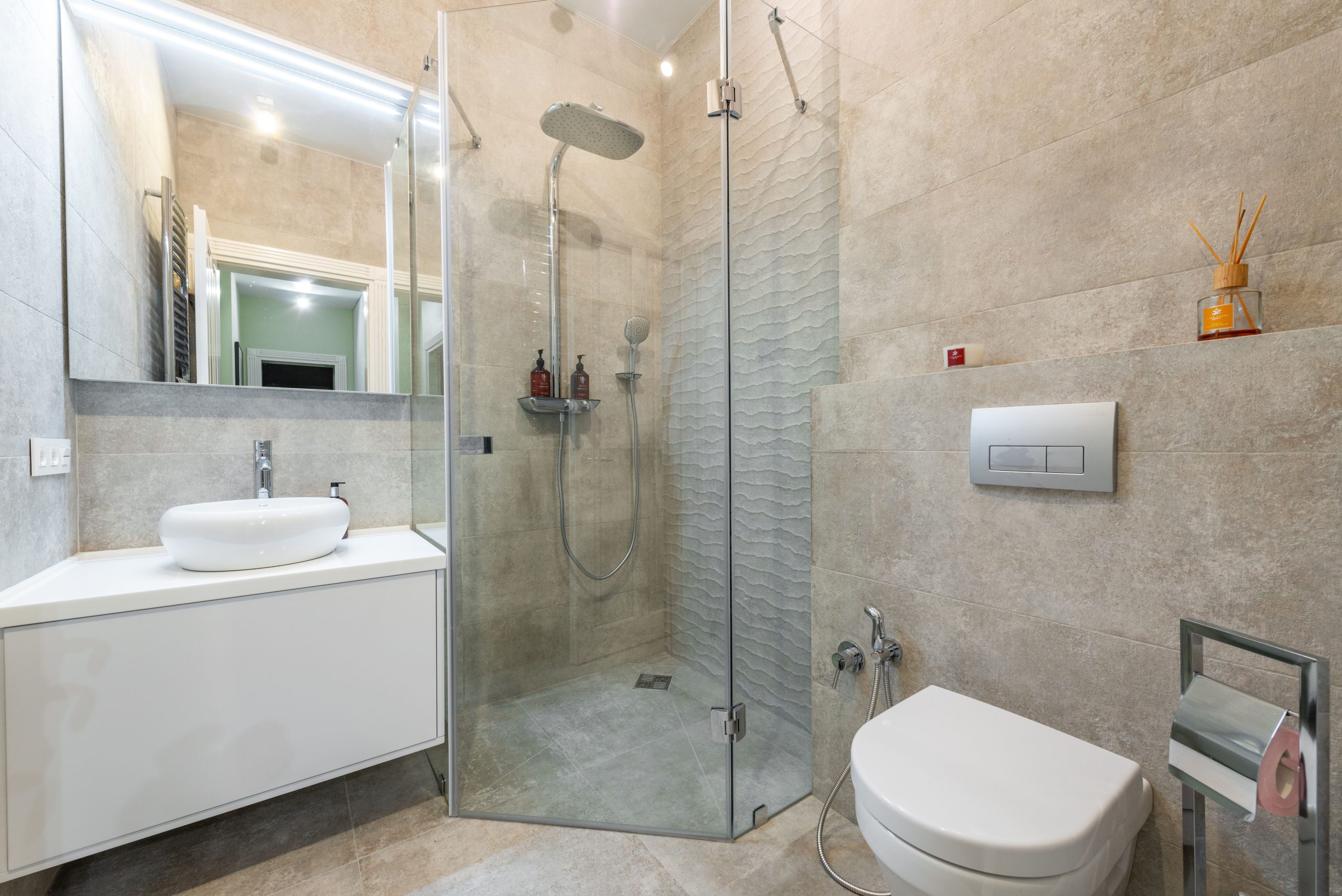
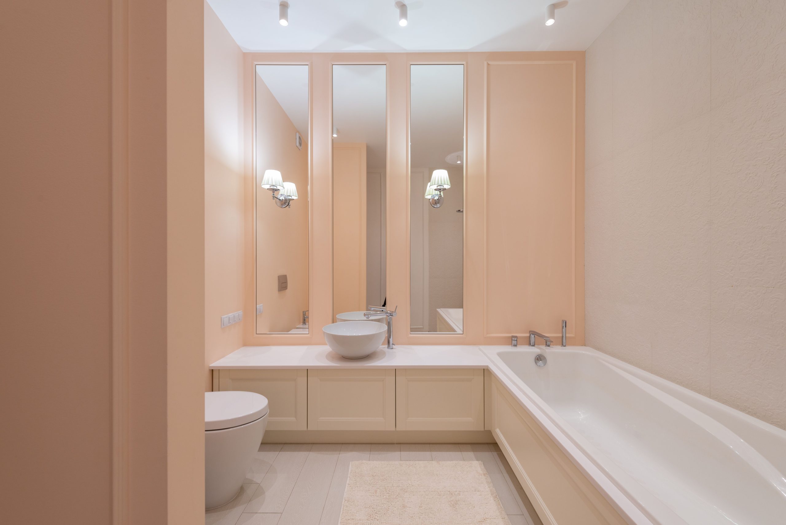
The safest high-impact move is the vanity. A wood-toned or sage vanity against warm white walls instantly updates a bathroom without touching plumbing or tile. Next, consider the walls above the tile line — paint is the cheapest transformation in the room, and a warm neutral paint color changes the entire mood for the cost of a gallon. Textiles do the rest: towels, a bath mat, and a shower curtain in clay, oatmeal, or eucalyptus tones layer color without commitment. If you are retiling, warm-toned stone-look porcelain or handmade-look ceramic in creamy whites adds permanent warmth underfoot and on walls.
Keeping it timeless, not trendy
The fear with any color trend is dating your bathroom. The defense is proportion: keep roughly 70 percent of the room in enduring neutrals — warm whites, soft grays, natural wood — and let the trendier tones live in the remaining 30 percent, in elements that are easy to change. Paint, textiles, and accessories are reversible. A terracotta vanity is a commitment; terracotta towels are an experiment. This is the same discipline designers apply when planning a warm and welcoming bathroom: warmth comes from layers, not from a single bold decision.
What this means for fixtures and finishes
Warm palettes change which finishes look right. Cool chrome can feel harsh against creamy walls, which is one reason brushed brass, champagne bronze, and matte black hardware are surging — they harmonize with warm neutrals in a way chrome sometimes does not. If you are selecting a shower panel for a warm-toned bath, brushed stainless or black-finished components tend to sit more comfortably in the palette than high-polish chrome. The fixture becomes part of the color story, not a cold interruption in it.
Small bathrooms: color without shrinking the room
A common worry is that color makes a small bathroom feel smaller. In practice, mid-tone warm colors often make small baths feel larger than stark white does, because white creates harsh shadow lines in tight corners while warm tones blur boundaries. The trick is continuity: carry one warm neutral across walls and ceiling, keep the floor a tone darker for grounding, and let the mirror and lighting do the expanding. These are the same principles behind shower designs for compact bathrooms — visual continuity makes tight footprints feel generous.
Lighting: the color you forget to choose
Every paint color is two colors: the one on the swatch and the one under your bulbs. Warm neutrals demand warm light — 2700K to 3000K bulbs preserve the creaminess, while cool daylight bulbs will drag your carefully chosen greige back toward gray. If you are swapping a rain shower head or rethinking the shower zone as part of the refresh, remember the shower needs its own light source too; a dim corner makes even the prettiest tile fall flat. And while you are at it, a few water-saving habits — shorter showers, a low-flow head — keep the beautiful new bathroom aligned with lower utility bills.
The bottom line
The 2026–2027 bathroom palette is an invitation to make the smallest room in the house feel like the most considered one. Start with warmth on the walls or vanity, echo it in textiles and metals, light it warmly, and keep the boldest choices reversible. You do not need a gut renovation to leave the white-box era behind — you need a gallon of paint, a point of view, and the confidence that cozy beats clinical.